Piddle Paddle Tours Brochure
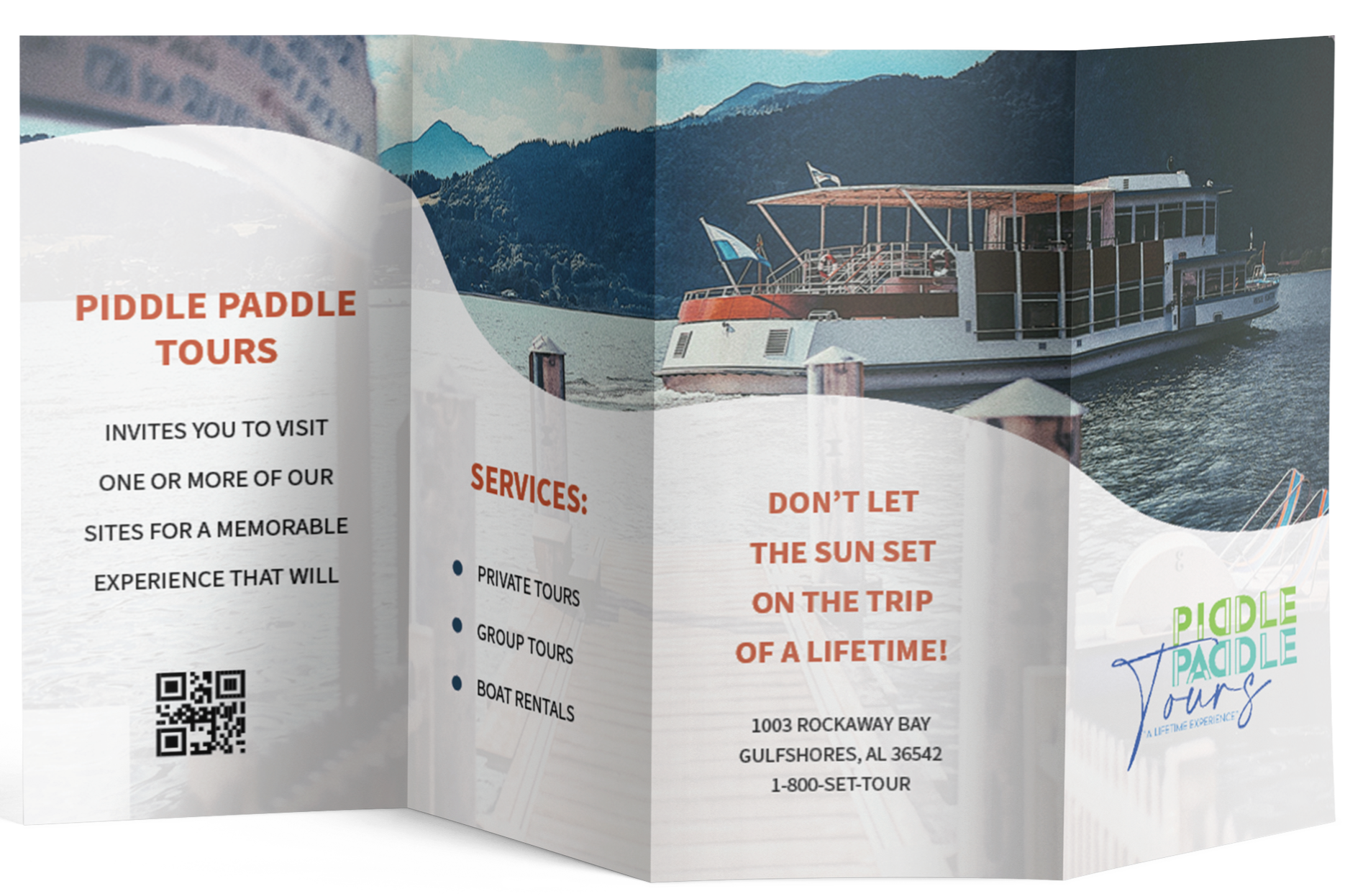
The objective was to create a dynamic, four-panel roll fold brochure (11"x17" flat, CMYK) for PiddlePaddle Tours, a client with a "fun" and playful brand identity. My first step was organizing the client's provided copy and imagery, pairing visuals with corresponding sea adventures to establish a clear content hierarchy. This organization naturally determined the content sequencing: the viewer is first introduced to the business on the cover, followed by service details, a welcome message with a QR code, and contact information accessible on the exterior.
Strategic Grid & Layout I selected a modular grid as the foundational structure, which allowed for the necessary flexibility in arranging both text and images across the eight pages. While the pagination and folding method (a four-panel roll fold, fitting standard 4.35" pamphlet holders) dictated the basic architecture, a critical design decision was to intentionally break the grid. This departure from strict adherence to the fold lines allowed text and images to extend across panels, introducing a dynamic sense of movement and depth that directly supports the client’s playful theme. This deliberate choice was further enhanced through experimentation with custom shapes, opacity shifts, and gradients, creating layers and visual interest not typically seen in standard tri-folds.
Typography and Visual Hierarchy I utilized a clean sans serif typeface with varying weights to build a strong, legible visual hierarchy. Headings, such as "Piddle Paddle Tours" and "Services," are prominent to immediately capture attention. Subheadings for individual tour destinations are rendered in bold uppercase, guiding the reader through the detailed content seamlessly. Color contrast was a key tool in this hierarchy:
Urgency & Focus: A red-orange font, drawn from the cover image, provides immediate focus and a sense of urgency on the front panel.
Clarity & Engagement: Blue and green headings on the interior spread create striking contrast against the background, ensuring high readability and continuous engagement with the content.
Print Production & Presentation While I focused on the content and visual composition (reader spread), print imposition was considered in the initial stages to account for folding compensation, ensuring the final product would fold correctly. In presenting the final design, a reader spread was chosen over a technical printer spread to provide the client with the clearest and most effective visualization of the final product's experience.