racer x games: brand identity
Coursework project: Designed a complete brand identity package, including a logo and style guide, for a hypothetical gaming company.
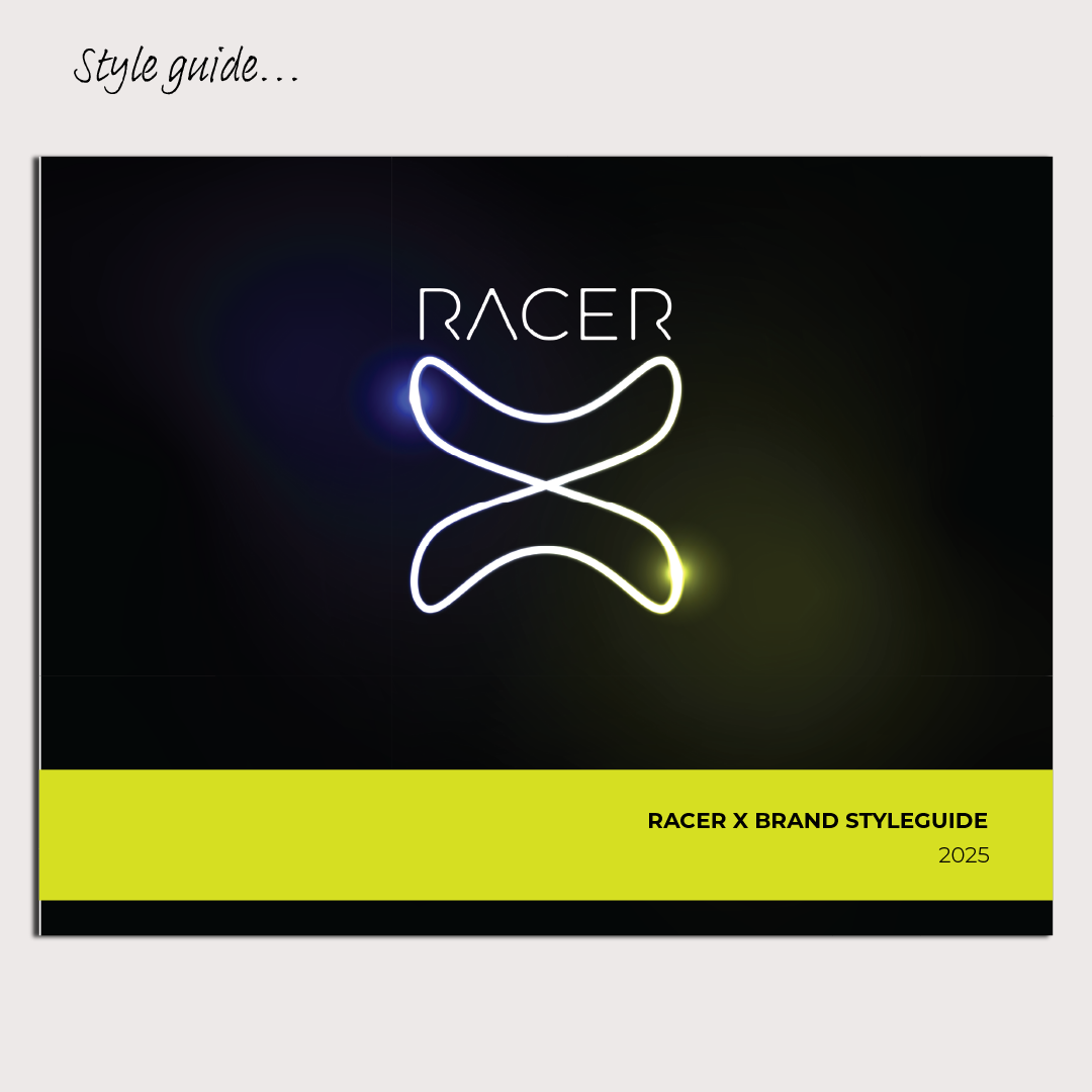
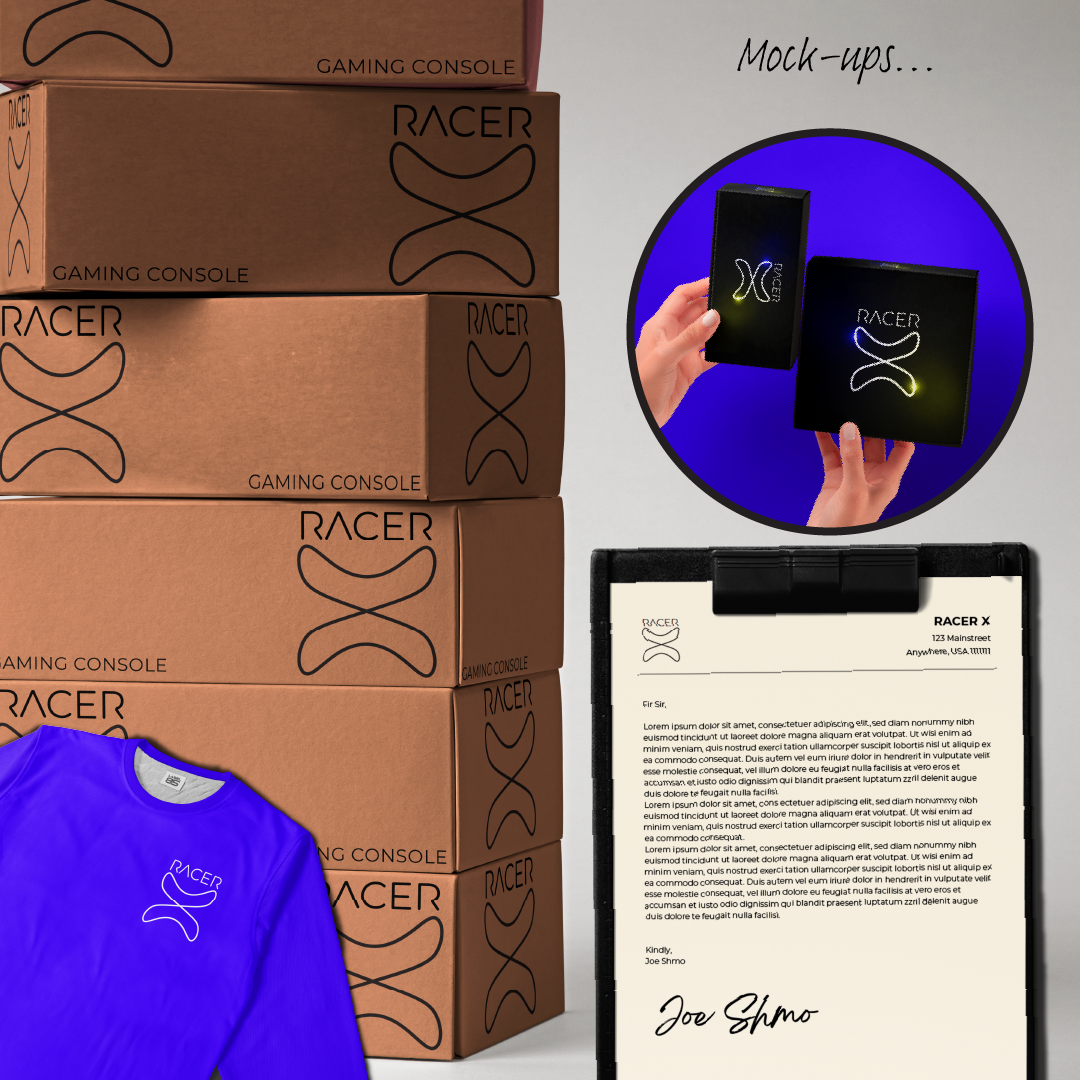
The purpose of the Racer X Brand Identity was to create a clear and engaging mark and comprehensive style guide for a gaming company focused on providing accessible, family-friendly games. The design needed to visually convey speed and forward momentum while communicating stability and trust. I applied several key practices, starting with the main mark: a symmetrically balanced "infinity X" form. Paired with a strategic neon green and electric blue color palette, this mark utilizes a subtle glow effect to give the impression of constant movement, fitting the "racer" theme. The color choices were deliberate: blue suggests stability and reliability, while green signals progress and action, consistently supporting the company's positive brand message.
To ensure the logo was ready for professional deployment, I delivered it as a fully scalable vector file, which is essential for maintaining quality and clarity across all outputs, from large signage to small mobile interfaces. This project also included a comprehensive style guide where I employed consistent typographical hierarchy for the text-heavy document, to optimize readability by the organization’s employees. The primary round of iteration focused on adjusting the line weight of the "infinity X" and the “Racer” text, and softening the intensity of the neon glow. This careful refinement was important for confirming the logo's legibility when minimized (such as for a favicon or app icon), successfully transforming the initial concept into a versatile and commercially ready logo.